Saving my plants with a plant watering app — a UX case study

Image made with Artboard Studio
Background
Remembering to water your plants sounds like an easy task. So how do so many of us end up with wilted and dead plants shortly after purchase? Looking through the top results of Google about houseplants, you will find a surprising number of links titled “Keeping plants alive”, “Why is my plant dead?” and “How to bring my plant back to life”.
According to the National Gardening Association, “Thirty-five percent of all U.S households, or 40 million households, grew indoor houseplants in 2006.” That is a staggering number of people and yet many of them forget or are unsure of how to properly care for those plants, including me.
I recently purchased several plants for my own home and quickly discovered keeping plants alive was not as easy as I would have thought. I found myself forgetting to water some plants for weeks and others I would over water. I even killed a small bamboo plant, which I was assured was extremely difficult to do. For me it was easy. I simply forgot to care for it. So I turned to my phone for a solution to my woes.
Problem
After looking through several “water reminder” apps for my near dead plants, I found myself confused and frustrated. Though there were several offered, I found some apps were overcomplicated with too many icons and pages to track, while other apps required me to know way more about the plant than I did.
There was no middle ground between overwhelming overload and confusing minimalism.
A later search on the internet led me to an article suggesting 5 different apps, each for a different aspect of plant care, that would help me understand how to keep my plants alive. But needing to download 5 different apps for 1 problem seemed way too much for my limited storage plan and for my attention span. Being a plant parent didn’t have to be that hard. So I did what any designer would do, I decided to turn this problem into a personal project and a challenge for myself.
The objective: Design a plant watering and care mobile app that worked for veteran plant owners and newbies alike.
Research and prototyping
During my research I identified and focused on a set of scenarios to prevent feature creep and to create a simple to use app. The scenarios are as follows:
-
User knows the types and/or names of plants and how to care for them
-
User knows some of the types and/or names of plants and only a little bit about care
-
User knows nothing about their plants or how to care for them
These might seem a bit obvious at first, but putting them down in writing ensured my focus remained on all 3 of these scenarios.
The goal was to create a useful tool for all users regardless of their knowledge of plants and plant care.
Competitive analysis

App icons for Koubachi, HappyPlant, Plantbook, and WaterMe
To understand the needs of users and their pain points, I reviewed several apps and their comments sections to understand what was working and what was not. As this was a personal project I used this method of gathering data for its ease of access and my own time constraints.
I limited my choices to apps that:
-
were free from the onset (in-app purchases were fine)
-
had reviews and comments so that I could hear from the users what they felt about the app
-
had a plant watering feature
I read and categorized the comments of apps in the Apple app store to gather data from the user’s perspectives.
Here are some categories/commonalities of comments that were asked for or done right by some of the apps:
-
Care instructions are provided
2. Ability to name and take pictures of plants
3. Clear dates of when a plant was last watered
4. Simple design
Here is a list of things that users gave negative ratings and reviews for:
-
Requiring geographic data or other personal data of users to track plants
-
In-app or physical purchases to use app fully
3. Inability to identify plants
4. No control of scheduling
5. Confusing delineation between plants that need to be watered today and plants you already watered
With this all in mind I set out to create a solution that would solve these issues and expand upon the good feedback to create a positive experience.
User personas
I used the scenarios and research to build out 4 user personas and journey maps to further focus on the needs of users. These each had unique goals and backgrounds, creating useful insight and data to create an experience that would be useful and enjoyable for all users. I iterated on the user journey maps when coming up with my prototypes and made adjustments to ensure a smooth journey. The user journey maps you see are those that I have worked through to make sure all users have access to what they need in as few taps as possible.


By creating these, I could work to improve functionality and usability to ensure ease of use for each persona.
Design tool: Framer
In creating my solution I decided I wanted to work with a new design tool I had not tried before. I had heard great things about Framer and wanted to test my skills even further. Framer ended up being a fun and easy way to build out an interactive and reactive prototype in a way I had not before. Since I started my career as a developer, I found the ability to “code” the interactions using Framer’s documentation a great feature that gave me flexibility and freedom. It is a tool I will definitely use more of in the future.
Prototype considerations
After a few iterations on my prototypes I started reading articles about smartphones and finger placement. It was this article by Josh Clark and the research mentioned in the article (by Steven Hoober) that really made me want to reconsider my design to be more “thumb friendly”. Many users including those in my user personas, would benefit from using this app with one hand. In the “Solution” section I will further explain the “homepage” design I came up with based on this research and inspiration.
As you might have noted in my user journey maps, some of the designs were influenced by the ability to reach the main parts of the app with one hand on the phone.
Solution

My “Design” board in Framer
After a few prototypes, tests of usability, and with the research conducted in mind, I tried to find a solution to the problems users were facing and create a simple mobile app to water and care for plants.
Homepage
Homepage main interactions
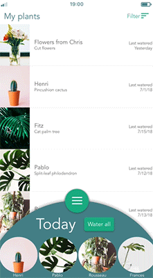
The homepage was my biggest consideration as I wanted users to be able to access all parts of the app within only a few taps. As mentioned, I iterated off of initial prototypes to create a more thumb friendly version of the app. The homepage contains the following content:
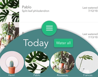
Watering daily plants — A basic user journey/scenario I focused on and worked heavily to make right, was the interaction of watering the plants that needed water that day. I wanted to make sure this piece was accessible upon opening the app each day. Though if everything was watered, I didn’t want this function getting in the way of the rest of the app.
Watering interaction
The swipeable “Today panel” made for a good solution to something that could be open at the start of each day with whatever needed watering, closeable if you wanted to look at other parts of the app, and auto-closeable to give the satisfying “you’re done” moment to users once they watered all their day’s plants. Keeping this at the bottom of the screen meant users could water with one hand and tap with the other to complete their daily tasks.
Navigation — I wanted the navigation to also be easily accessible with one hand so I merged the Today panel with the Navigation button. That choice ended up making the ability to swipe up easier, as the Navigation button also provided a tab to “pull” the Today panel open.

Navigation menu screenshot
I kept the menu options to a minimum, 3 buttons to take you to the only 3 other sections of the app.
-
The “Library” button accesses the library without having to go through the “Add plant” process. If you want to learn about plants that are not on your list, you can easily do so using the library.
-
The “Add plant” button takes you through the process of adding a new plant to your list.
-
The “Calendar” button is something I added later on when I discovered users might want to see what they watered in the past (which they can do by looking at “My plants”) but also what plants will need watering in the future and when. Providing this option helps users visualize, track, and plan if they so choose.
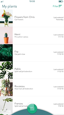
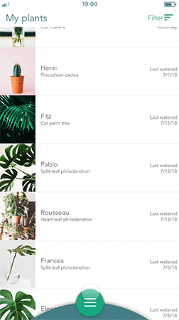
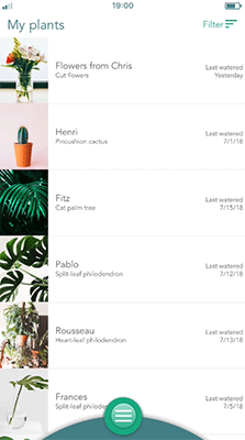
My plants — The ability to see what plants they have and sort through these plants through various criteria was a must as users might need to track what plants they even own (see User persona - Gabby). Users can see quickly when they last watered each plant so they are more aware of what they have done and what they need to do. I added the filter option to make it easier for users to parse through the potentially long list.
The options for filters are:
-
Name
-
Location in home
-
Date of last water
-
Type of plant
Users could also click into each plant to learn more about it, make edits, or remove the plant from their list.
Plant library
Process of using the Library
Giving users the ability to learn more about plants they may or may not have was a must. As I would already be pulling the database of plant information, I wanted to make it accessible at all times to users, not just when they were selecting a new plant (see User persona - James). Giving new plants easy discoverability was key to learning and staying engaged in the app even after a user was done watering plants for the day.
To navigate through the library users have 3 options, so no matter their search preference or if they had a plant specifically in mind, they could find what they were looking for. Here are the options:
-
Use the search bar
-
Scroll through the entire list
-
Jump to sections via the alphabet on the righthand-side
Each plant offered more information about itself such as suggested watering intervals, sunlight requirements, and comfortable temperature.
Adding a plant
Process of adding a plant (in this case if you don’t know the plant type)
The main goal of this section was to let plant owners easily add their plant to the app so they could begin care. This part is one users need to get right, but don’t necessarily want to spend a lot of time doing.
To make adding plants easy for users I wanted to incorporate the ability to use a “Google Image” way of guessing the plant a user had. Offering the option to take a picture and figure out the plant automatically could ease any user’s worries about not knowing all the information about their plant.
Once a user selected their plant, they would be able to edit information about their plant and have some information (such a watering interval and sunlight) input for them.
Calendar
Process of checking the calendar
As mentioned before, this section was added later on to give users the opportunity to track and look ahead at what plants would need watering. Without having to check the cycle of each plant, this would give users a chance to see what the next few days would look like.
Conclusion
This was a fun project that allowed me to try some new methods and stretch my design muscles. I had not had much practice in creating user journey maps or in using Framer to build prototypes, and challenging myself with both made the results all the more worth it. I learned a great deal about creating interactive prototypes in Framer and how useful micro-interactions, such as buttons reacting to a tap, can be. And as mentioned before, I learned about thumb friendly screens and how a simple flip from a top menu to a bottom menu can really help users reach their goals more efficiently.
Unfortunately, due to time constraints, the research was only based on a small set of data so further research, testing, and analysis would be needed to validate my choices.
But practice makes perfect! So cheers to more testing, learning, and case studies.